
UI Overview
A visual walkthrough of every panel, toolbar, and control in the Noteism editor window — annotated with numbered callouts so you know exactly where things live.
Below is an annotated screenshot of the full Noteism editor window. Each numbered callout maps to a section on this page describing exactly what that panel does, how to interact with it, and what options control its behavior.
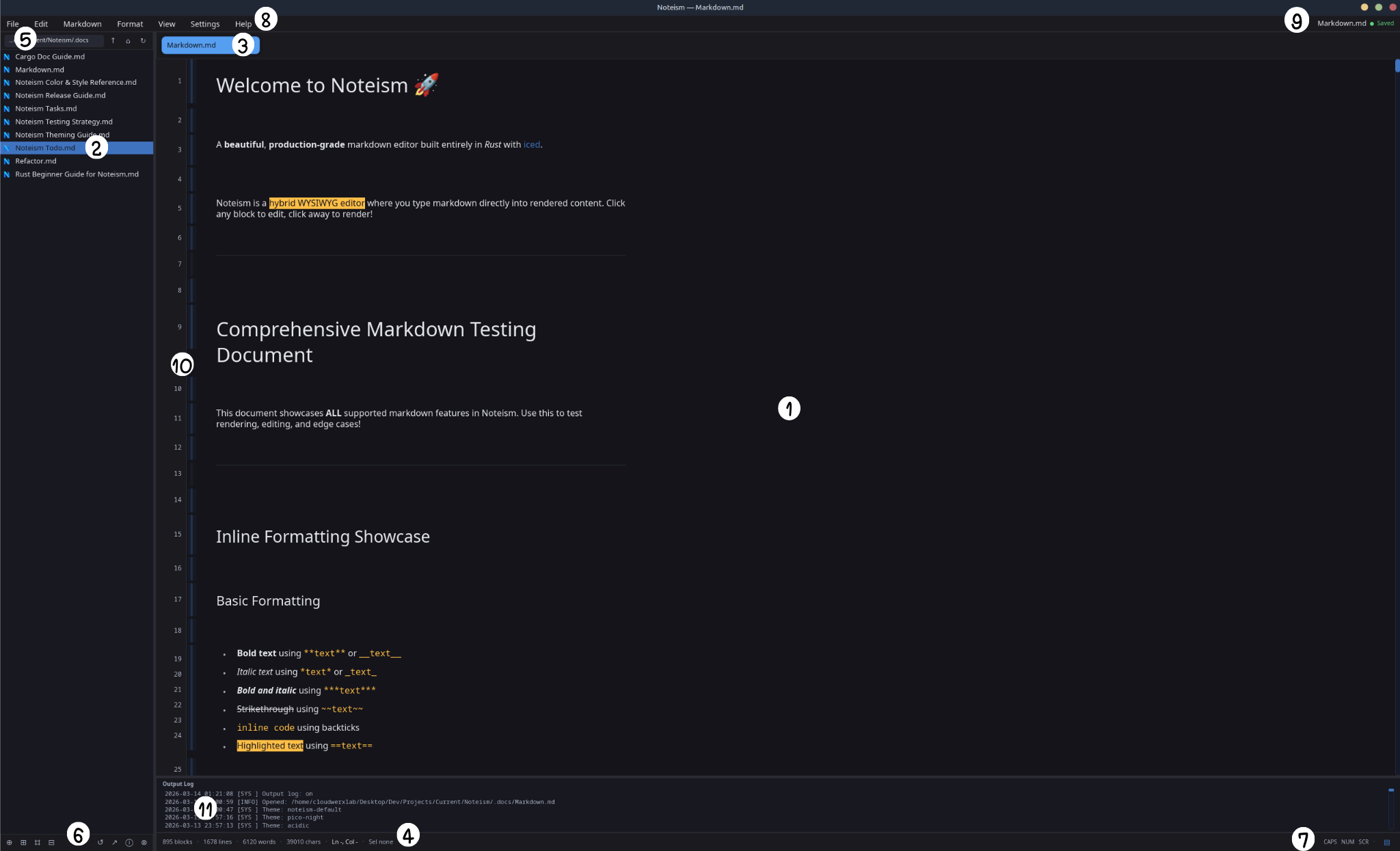
① Editor Area
The editor area is the central, largest region of the window — it is where you write. This is the core of Noteism's hybrid editing model: you type raw Markdown directly into rendered content.
How the hybrid editor works
Noteism uses a block-based architecture where every Markdown element (heading, paragraph, code block, list, table, etc.) is an independent block. Each block has two states:
| State | What you see | Triggered by |
|---|---|---|
| Render mode | Beautifully styled output (headings in display size, lists with bullets, styled tables, etc.) | Clicking away from a block, pressing Esc, or blurring focus |
| Edit mode | The raw Markdown source in a text editor widget | Clicking on a rendered block |
- Click any rendered block → it opens into a text editor showing raw Markdown.
- Click away or press Esc → the block re-renders as styled output.
- Ctrl+Enter creates a new block below the current one.
- Enter adds a newline within the current block.
Content width and scrolling
The editor area is a scrollable viewport. Content is horizontally constrained to a maximum width of 900 px for comfortable reading, with generous padding on all sides (34 px top/bottom/right when line numbers are off, left padding adjusts based on gutter visibility).
Viewport culling (performance)
For long documents with heavy content (Mermaid diagrams, syntax-highlighted code blocks, large tables), Noteism employs viewport culling: only blocks within the visible scroll region (plus a 300 px buffer above and below) are fully rendered. Off-screen blocks are replaced with lightweight fixed-height spacers. This dramatically reduces the work per frame and keeps the editor responsive even in multi-hundred-block documents.
Supported block types
The following Markdown block types are detected and rendered:
| Block type | Markdown syntax | Notes |
|---|---|---|
| Heading (1–6) | # H1 through ###### H6 | Auto-detected as you type |
| Paragraph | Plain text | Default type for new blocks |
| Code block | ``` fences | Syntax highlighting with language detection |
| Unordered list | - item or * item | Nested indentation supported |
| Ordered list | 1. item | Sequential numbering |
| Task list | - [ ] task / - [x] task | Interactive checkboxes in render mode |
| Blockquote | > text | Styled with accent border |
| Table | Pipe-delimited GFM tables | Rendered as a styled table; supports inline raw editing |
| Horizontal rule | --- or *** | Thin divider line |
| Math block | $$...$$ | Display math rendering |
| Mermaid diagram | ```mermaid | SVG rendering with caching |
| TOC | [TOC] | Auto-generated table of contents from headings |
| Alert/Callout | > [!NOTE], > [!TIP], etc. | GitHub-style callout boxes |
| Definition list | Term\n: definition | Styled definition list |
| YAML front matter | --- delimiters | Rendered as a metadata block |
| Emoji | :shortcode: | Auto-complete popup with fuzzy matching |
Inline formatting
Within any block, inline formatting is rendered in-place:
- Bold (
**text**or__text__) - Italic (
*text*or_text_) - Bold + Italic (
***text***) Strikethrough(~~text~~)inline code(backticks)- ==Highlighted text== (
==text==) - Underline, superscript, subscript
- Inline math (
$...$) - Links (
[label](url)) — clickable in render mode
② File Manager Panel
The left sidebar is the File Manager — a workspace-aware file browser.
Opening a workspace
There are several ways to open a workspace:
- File → Open Workspace... from the menu bar
- The ⌗ (Open Workspace) button in the sidebar toolbar
- Setting a default workspace in Preferences → General → Files
- Typing or pasting a path directly into the navigation bar at the top of the sidebar
Navigation bar
At the top of the File Manager panel there is a path navigation bar with two modes:
| Mode | Behavior |
|---|---|
| Display mode | Shows a right-truncated path (e.g. …/Projects/Current/Noteism) so the deepest folder name is always visible. Click to switch to edit mode. |
| Edit mode | Full path shown in an active text input. Type or paste a new path, then press Enter. |
Three icon buttons sit to the right of the path bar:
| Button | Action |
|---|---|
| ↑ | Navigate up one folder |
| ⌂ | Jump to your home directory |
| ↻ | Refresh the current folder listing |
The file tree
Files and folders are displayed in a scrollable tree list:
- Folders show expandable triangle arrows (
▸collapsed /▾expanded). Click the arrow or the folder name to expand or collapse. - Files display with system file icons; supported Markdown files (
.md,.markdown,.mdown,.mkd,.mkdn,.mdwn,.mdtxt,.txt) use the custom Noteism document icon. - Indentation increases by 10 px per nesting depth for visual hierarchy.
- Selection highlighting uses the theme accent color — clicking a file opens it in a new tab (or switches to its existing tab).
Hidden files
By default hidden files and folders are shown. Hidden entries are defined as:
- Files or directories whose name starts with a
.(dot-prefix, Unix convention) - On Windows: files with the
FILE_ATTRIBUTE_HIDDENflag
You can toggle hidden file visibility in Preferences → General → Files → Show hidden files.
Hidden files toggle
The Show hidden files preference is persisted in your config at
~/.config/noteism/config.json under the show_hidden_files key.
It defaults to true.
Right-click context menu
Right-clicking any file or folder entry opens a context menu:
| Action | Applies to | What it does |
|---|---|---|
| 📄 New File | Files & Folders | Creates a new untitled Markdown file in the same directory |
| 📁 New Folder | Files & Folders | Creates a new folder in the same directory |
| ✏️ Rename | Files & Folders | Activates inline rename — type the new name, press Enter |
| 📂 Reveal in File Manager | Files & Folders | Opens the containing folder in your system file manager |
| ⓘ Properties | Files only | Shows file properties (path, size, permissions, timestamps) |
| 🗑️ Delete File / Folder | Files & Folders | Deletes the entry (with confirmation dialog for safety) |
| ✕ Close | — | Dismisses the context menu |
Action toolbar
A compact icon toolbar sits at the bottom of the File Manager panel:
Left group (always active):
- ⊕ New File
- ⊞ New Folder
- ⌗ Open Workspace
- ⊟ Collapse All
Right group (context-aware, dimmed when nothing is selected):
- ↺ Rename
- ↗ Reveal in File Manager
- ⓘ Properties (files only)
- ⊗ Delete
Each button has a tooltip that appears on hover.
Sidebar resizing
The File Manager panel width is adjustable. A thin vertical strip between the sidebar and the editor area can be dragged left or right to resize:
- The strip highlights with the accent color while actively resizing.
- Width is clamped between 160 px and 600 px.
- The default width is 280 px.
③ Tab Bar
When you have one or more documents open (beyond the startup landing page), the tab bar appears at the top of the editor area (below the menu bar).
Tab appearance
- Each tab shows the filename (e.g.
Markdown.md), truncated to 20 characters with...if longer (14 characters when hovered to make room for the close button). - Active tab: highlighted with the theme's
tab_activecolor and an accent border, with a subtle shadow. - Dirty indicator: an amber
●dot appears before the title when the file has unsaved changes. - Close button: a red
×button appears on hover. Clicking it triggers the tab close flow (with unsaved-changes protection if the file is dirty).
Tab interactions
| Action | Behavior |
|---|---|
| Click a tab | Switches to that document |
| Drag a tab | Reorder tabs via drag-and-drop. A thin accent-colored indicator shows the drop position. |
| Right-click a tab | Opens the tab context menu |
| Hover a tab | Shows the close button and adjusts title truncation |
Tab context menu
Right-clicking a tab opens a context menu with:
| Action | What it does |
|---|---|
| ✖ Close Tab | Closes this tab |
| ⇤ Close Tabs to Left | Closes all tabs to the left of this one |
| ⇥ Close Tabs to Right | Closes all tabs to the right of this one |
| ⨯ Close Other Tabs | Closes every tab except this one |
| 🗑 Close All Tabs | Closes all open tabs |
| 📂 Reveal in File Manager | Opens the file's location in the system file manager |
| ⓘ Properties | Shows file properties dialog |
Tab overflow
When more tabs are open than can fit in the available width, navigation arrows (◀ / ▶) appear at the right end of the tab bar. The visible tab capacity is dynamically calculated based on the window width minus sidebar width, with each tab slot approximately 186 px wide.
④ Status Bar (Footer)
The status bar runs along the bottom of the editor area. It provides at-a-glance document statistics and editor state.
Left side — document metrics
Displayed as a dot-separated row:
- Block count (e.g.
895 blocks) - Line count (e.g.
1678 lines) - Word count (e.g.
6120 words) - Character count (e.g.
39010 chars) - Cursor position (e.g.
Ln 4, Col 12) — showsLn -, Col -when no block is focused - Selection count (e.g.
Sel 3 blocksorSel none)
If a recent export was performed, an export status indicator (green "Export ready" or amber "Export failed") also appears.
Efficient stat computation
Document statistics are pre-computed and cached — they only recalculate when content actually changes, not on every frame render.
Right side — keyboard and mode indicators
- CAPS / NUM / SCR — lock key indicators. Displayed in the accent color when active, muted text when inactive. These are tracked by toggling on each key-press.
- View mode toggle — a clickable icon button (see section ⑦).
⑤ Menu Bar
The top-level menu bar contains seven dropdown menus. Each menu item shows its keyboard shortcut (if it exists) on the right side.
File menu
| Item | Shortcut | Description |
|---|---|---|
| New File | Ctrl+N | Creates a new untitled document in a fresh tab |
| Open File... | Ctrl+O | Opens a system file picker dialog |
| Save | Ctrl+S | Saves the current document |
| Save As... | Ctrl+Shift+S | Saves to a new file path |
| Export › | — | Flyout sub-menu (see below) |
| Open Workspace... | — | Opens a folder picker to set the workspace |
| New Folder | — | Creates a new folder in the workspace (appears only when a workspace is open) |
| Refresh | F5 | Refreshes the file browser (appears only when a workspace is open) |
Export sub-menu provides these formats:
HTML, HTML (without styles), PDF, Word (.docx), OpenDocument (.odt), RTF, EPUB, LaTeX, Reveal.js, MediaWiki, reStructuredText, Textile, OPML, Pandoc Markdown, CommonMark, GitHub Flavored Markdown — plus "With Previous..." and "Overwrite Previous" for re-exporting.
Edit menu
| Item | Shortcut |
|---|---|
| Undo | Ctrl+Z |
| Redo | Ctrl+Y |
| Cut | Ctrl+X |
| Copy | Ctrl+C |
| Paste | Ctrl+V |
| Select All | Ctrl+A |
| Find | Ctrl+F |
| Replace | Ctrl+H |
Markdown menu
A flyout menu with seven sub-sections:
| Section | Items |
|---|---|
| Headings | Heading 1–6 (Ctrl+Alt+1–6), Paragraph (Ctrl+Alt+0) |
| Blocks | Blockquote (Ctrl+Alt+Q), Unordered List (Ctrl+Alt+U), Ordered List (Ctrl+Alt+O), Task List (Ctrl+Alt+K), Code Block (Ctrl+Alt+C), Horizontal Rule (Ctrl+Alt+R), Table (Ctrl+Alt+T), Definition List (Ctrl+Alt+D) |
| Inline | Hard Line Break (Ctrl+Alt+B) |
| References | Link (Ctrl+Alt+L), Footnote (Ctrl+Alt+F), TOC (Ctrl+Alt+M), YAML Front Matter (Ctrl+Alt+Y) |
| Images | Insert Local Image, Inline Image Template, Remote Image Template, Classic Image (Ctrl+Alt+I) |
| Alerts | Alert NOTE (Ctrl+Alt+N), Alert TIP (Ctrl+Alt+P), Alert IMPORTANT (Ctrl+Alt+A), Alert WARNING (Ctrl+Alt+W), Alert CAUTION (Ctrl+Alt+X) |
| Math | Display Math Block (Ctrl+Alt+E), Inline Math (Ctrl+Alt+$) |
Format menu
| Item | Shortcut |
|---|---|
| Bold | Ctrl+Shift+B |
| Italic | Ctrl+Shift+I |
| Strikethrough | Ctrl+Shift+D |
| Inline Code | Ctrl+Shift+E |
| Highlight | Ctrl+Shift+H |
| Underline | Ctrl+Shift+U |
| Subscript | Ctrl+Shift+J |
| Superscript | Ctrl+Shift+K |
| Link Label | Ctrl+Shift+L |
| Inline Math | Ctrl+Shift+G |
View menu
Toggle items (checkmarks show current state):
| Item | Shortcut | Toggles |
|---|---|---|
| File Manager | Ctrl+B | Sidebar file browser visibility |
| Table of Contents | Ctrl+T | TOC sidebar panel |
| Source Code Mode | F6 | Full-document raw Markdown editor |
| Toggle Line Numbers | Ctrl+L | Line number gutter |
| Block Guides | — | Vertical block guide lanes |
| Output Log | — | Output log panel visibility |
Settings menu
| Item | Description |
|---|---|
Preferences... (Ctrl+,) | Opens the full Preferences dialog |
| Themes › | Flyout sub-menu listing all installed themes, grouped by Dark and Light, with a checkmark on the active theme. Scrollable if many themes are installed. |
Help menu
| Item | Description |
|---|---|
| About Noteism | Opens the About dialog |
Documentation (F1) | Opens the docs site |
Keyboard Shortcuts (Ctrl+/) | Shows the shortcuts reference |
| Noteism.app | Opens the main website |
| Themes | Opens the themes site |
| Plugins | Opens the plugins site |
| Donate | Opens the donation page |
⑥ Sidebar Action Toolbar
At the very bottom of the File Manager panel is the compact action toolbar. This is the narrow icon strip described more fully in Section ②.
The toolbar is split into two groups:
- Left group — always-active actions (New File, New Folder, Open Workspace, Collapse All)
- Right group — context-aware actions that dim when no file or folder is selected (Rename, Reveal, Properties, Delete)
All buttons have dark-card-style tooltips that appear on hover.
⑦ View Mode Toggle
At the far-right end of the status bar sits a small view mode toggle button.
| Icon | Mode | What it means |
|---|---|---|
| ▤ | Hybrid (default) | Block-based rendered editing — the main Noteism experience |
</> | Source | Full-document raw Markdown in a single text editor |
Clicking the button (or pressing F6, or using View → Source Code Mode) switches between the two modes. When switching:
- Hybrid → Source: the block content is serialized into one Markdown string and displayed in a monospace text editor with syntax highlighting.
- Source → Hybrid: the raw Markdown is re-parsed back into blocks. This round-trip is lossless.
The toggle uses the theme accent color for its icon and highlights on hover.
⑧ Title Bar
The window title bar is managed by the operating system (Noteism uses native window decorations). The title dynamically reflects the current state:
| State | Title shown |
|---|---|
| Startup landing page (no documents) | Noteism |
| Document open | Noteism — filename.md |
The window icon is the Noteism logo, loaded from the .art/ directory in the
following priority order: logo-512.png → logo-256.png → logo-128.png → logo-64.png. The application ID is set to noteism for desktop environment
integration.
⑨ Save Status Indicator
On the right end of the menu bar row (not the status bar — the very top row next to the menu buttons), the current file's save status is displayed:
| Indicator | Meaning |
|---|---|
| filename.md ● Saved (green) | The file has no unsaved changes |
| filename.md ● Unsaved (amber/warning) | The file has been modified since last save |
This indicator only appears when a real document tab is active — it is hidden on the startup landing page. The colored dot and label give an immediate visual cue about dirty state without needing to check the tab bar.
⑩ Line Numbers and Block Guides
The numbered gutter on the left side of the editor area contains two optional features that can be independently toggled:
Line numbers
- Toggle with Ctrl+L or View → Toggle Line Numbers
- The gutter is 56 px wide with a subtle vertical divider separating it from the content area.
- Line numbers are displayed in a monospace font at 12 px.
- The active cursor line is shown in the main text color; all other lines use muted text.
- Numbers are document-level: they continue counting across block boundaries, so block 1 might be lines 1–5 and block 2 starts at line 6.
- A full-height gutter background strip is layered behind the scrollable content so the gutter color always extends to the bottom of the viewport regardless of content length.
Block guides
- Toggle with View → Block Guides
- Thin colored vertical lanes (18 px wide) that appear between the line number gutter and the content area.
- Each block type gets a distinct visual treatment using a semi-transparent accent color.
- When a block is focused (being edited), its guide lane highlights.
- Selected blocks also receive highlighted guide lanes.
The line numbers and block guides can be used together or independently. The content area padding adjusts automatically based on which features are active.
⑪ Output Log Panel
The output log panel sits between the editor area and the status bar. It is a collapsible, resizable panel that displays application events and diagnostics.
Visibility
- Toggle with View → Output Log in the menu bar
- Persisted in your config at
~/.config/noteism/config.jsonundershow_output_log
Content
The log shows timestamped entries with severity levels:
| Level | Label | Examples |
|---|---|---|
[SYS] | System | Theme changes, startup messages, settings updates |
[INFO] | Info | File opened, workspace changes |
[OK] | Success | Successful exports, file saves |
[WARN] | Warning | Non-critical issues |
[ERR] | Error | Export failures, file errors |
Each entry is formatted as: YYYY-MM-DD HH:MM:SS [LEVEL] message
History and persistence
- The log is persisted to disk at
~/.config/noteism/output_log.jsonso history survives app restarts. - Maximum capacity is 200 entries — oldest entries are dropped when the limit is reached.
- Each new session starts with a fresh
Welcome to Noteismbanner prepended (this banner is not persisted).
Interaction
- The log uses a read-only
text_editorwidget — you can select and copy text but not type into it. - The panel is scrollable with the standard themed scrollbar.
Resizing
A thin horizontal strip at the top of the panel serves as a resize handle:
- Drag up to make the log taller, down to make it shorter.
- The handle highlights in the accent color while actively dragging.
- Height is clamped between 60 px and 400 px.
- The configured height is persisted across sessions.
Right-click context menu
Right-clicking inside the log opens a context menu with:
| Action | What it does |
|---|---|
| 📋 Copy Selection | Copies the highlighted text (or "Copy All" if nothing is selected) |
| 🗑️ Clear Log... | Opens a confirmation dialog, then clears all log entries |
| ✕ Close | Dismisses the context menu |